introduction
Introduction script: Adversarial Interfaces
<tldr>
Adversarial interfaces is a critical response to the politics of a certain type of direct and personal address in user interfaces. As the amount of personal access points to the Internet multiply, so have websites opportunities to leverage visits in unexpected and questionable ways. However, the observation and analysis of the rhetorics of the interfaces of these websites can offer insight into the secondary agendas they may have. This project and this website propose case studies, theoretical scaffolds and collections of critical makings that together aim to practically and discursively enable a review of the infrastructures that surround our day to day digital activities. Adversarial interfaces draws upon re-purposed notions of design and political theories to outline way in which oppositions and alternatives to ethically questionable practices can exist.
</tldr>
I'm writing/talking today from a graphic designers perspective on the state of the Internet as a politically charged space; My job as a graphic designer follows current times and technological development in that I rarely design for static printed objects anymore, but indeed for changing online digital spaces. My work in the commercial space is best described as a type of tool curator.[ref]I get this reference to “tool curator” from “distinctions between three parties involved in the configuration of software” Privacy after the Agile Turn(Seda Gürses and Joris van Hoboken, 'Privacy After the Agile Turn, in: Selinger et al (eds.), The Cambridge Handbook of Consumer Privacy, Forthcoming) [/ref] I help make and develop websites for people and projects and in that process, I try and provide the best suited tool for the publishing needs of the website projects. This tool selection comes with a concern for ease and appropriate use, finding the best fitting procedures depending on the types of content that make up the online publication. Among these concerns for appropriate tooling I consider sustainability, ease and simplicity of processes, which inevitably means taking interest in how user interfaces work and communicate. Making websites has to deal with how content is managed, edited, transformed and maintained before being able to work on the public presentation. A relative autonomy of the people that end up managing the website day to day is also a major concern and the ease of this task again, very much comes down to how the interface works. My own work aside for the moment, I believe that only so much ease and automation can be built into digital (content management) tools, a large part of processes depend on ones awareness and understanding of computer and network infrastructure. Said differently, a large part of digital tools depends on ones digital literacy. And it is this very subject that I have been researching for the last couple of years; how user interfaces mediate digital literacy.
Mediation of digital literacy comes down to interfaces and interfacing. The parts of programs that are designed to be actionable by the user. The design of interfaces is of an entire field of it's own with a rich and interesting history. The very questions of how to interface for the user have been around ever since the idea of ‘home’ computers. While these questions are not new, the field has seen some serious development in the last decade, with the simple reason of the appearance of smaller, more portable, interconnected devices. Nowadays, most of these devices interface primarily through touch screens, a paradigm that is significantly different from mices, keyboards and screens. The object of this text/talk is not to dive into the history of interfacing. Rather I remain interested in a simple question: if the developed world sees us multiplying our devices and amount of use of interfaces, why is it that by now, we are not all computing and network experts? Again, I believe interfaces are the key here, as while they are the ways in which we use, they also create distance with the computational processes ‘underneath’.
Real world example
I have taken concern with this question as, despite my earlier description, my position as a “tool curator” sometimes does not suit the jobs I have. Sometimes, I engage in light tool and interface design of my own. A real world example I like to come back to is a story about the making of a content management tool for an art gallery website in Brussels. The concern here was the migration of all the encoded exhibition, artist and event content from the previous website. The employees did not want to have to rebuild from scratch to reboot the look of their website. For this project, I set out in the development of a custom content management system that would integrate old data and facilitate the future management of their website, according to the way they wished to portray the gallery online. [ref]https://github.com/colmoneill/Jason-Scraper[/ref] As development discussions went on, we eventually got to a point in time where I was explaining how the upload of images to specific sections would work. I thought I had covered all of the needs for this function, until I got an email back from the gallery confirming this way of doing, but with a small caveat: “you've forgotten to activate the drag and drop reorganisation of the images”. As stunned as I was to read this sentence, I can hardly blame the gallery worker to have thought that the dragging and drooping of image thumbnails to organise their order was a feature that could be turned on by ticking a box. The fact of the matter is that this project was extremely custom development, work that I was quite new to, but there was no reorganisation feature to be activated.
I believe that the reason for this confusion was the nature of the visual language I have been employing for the design of this interface. In fact, the “design” of this interface was not something I thought I would have time or budget for, so I employed a pre-built styling library [ref]read: Twitter bootstrap[/ref] to accelerate the front end aspect of the interface making. But in the choosing of this pre-built set of interface attributes, I had shot myself in the foot. Everything looked and felt too slick for what the back-end was actually ‘capable’ of doing. The front end was initially further ahead than the back-end portion of the tool. Preset grids and spacings, type and colour hierarchy confused the gallery into thinking that this custom interface I was building was an assembly of pre-existing things, not an absolute custom build. I tell this story because it points out the simple disconnect that can be experienced between an interface and the background processes. In lots of ways, this project would have been better served by a non styled interface, all browser defaults tool. This might have shown better the home made custom aspect of the tool. Instead, the pre-existing visual language that was given by the style library, employed referenced conventions that the gallery employees were recognising from other areas of their digital every day doings. The tool that was built had the same packaging that a lot of other had before, and a lot still have now. These wrappers and conventions come to be all that we see of the “technologies” we are using day in day out. And as we confuse technologies with packaging, wrappers and conventions [ref]These words Packaging, Wrappers, Conventions are said repeatedly by Ted Nelson in Computers for Cynics 0 —The myth of technology.[/ref], so can we observe other slight language shifts resulting from the common placing of computer devices and networks into our every day lives; we used to speak of computers, we now talk about technology. We used to speak of users, we now talk of 'People'. We used to speak of interfaces, we now talk of 'experiences'. [ref]Three examples extracted from Not Art&Tech — Olia Lialina 2015[/ref]
Language shifts
It is with these language shifts and the mental non-constructs that result from computer users to be thought of as end-only-users, that I take concern. It is from these observations that I am critical about modern user interfacing practices. Various other factors exist in the creation of confusion similar to the gallery example above, the widespread of devices is one pre-identified noise creator, the changing portrayal of software into products and today the changing of (software) products into services changes not only where what computer programs are, but where they run also. Despite other factors, the most concerning practice in digital confusion creation is, to my mind, the concern with seamlessness in user interface design.
Seamlessness and ease can be identified as primary focuses in the field of user interface design. Seamlessness is the idea that while the program or application you are currently using may need to pull resources from various different areas, local to the device or across a network, the experience of using the program should not reveal any of the componentry or any of the processes that happen in the background. Seamlessness is about ironing out any bumps, even if it means telling a lie or two along the way. But the idea of non visible seams goes further than the single app, it is carried over to unified platforms that are the software that our smartphones run upon, where efficiency is key and ease is king.
Aside; the notions of seamlessness, ease and simplicity constitute core notions of my thesis, Tangible tools available at http://tangible.tools .
It is important here to state that in and of themselves, aims to make a users process easier are not the point of critique. Rather, I am to question the understanding of “ease” in the user interface sense and the methods by which “seamlessness” is obtained. As touched upon above, the field of user interface design has shifted quite a bit in the last decade, with subcategories and specialisations of the job appearing: user experience designers, interaction designers, platform designers, user experience designers are all now titles that workers can hold within the tech industry. All of these jobs exist to think of software (products) can be made more slick, more enjoyable, and simpler to navigate.
Informal address interfacing
Below are some examples of a phenomenon I have been observing, in user interfaces, in the online-space. This next level attention of the user in some sort of informal address interfacing.
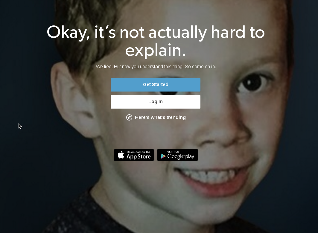 This image appears as the last of a handful of slides that aim to introduce newcomers to the blogging platform Tumblr.com. One of the first slides of this presentation says: “Tumblr is so easy to use that it's hard to explain.” After a few screens giving slightly more detail as to how easy Tumblr is to use, the concluding slide pictured above speaks directly to the visitor ans says; “Okay, it's not actually hard to explain. We lied. But now you understand this thing. So come on in.” Aside from the function of this informal address, the switch in and out of speech that first identifies complexity to later admit that actually this complexity was a deliberate lie raises a lot of questions as to what the relationship between the platform at it's users are. Questions such as; why the need to this multi slide presentation if there is no complexity at all? Why deliberately create confusion as to what the platform does, and how it does it? And if Tumblr.com is admitting to derivative explanations before a user has even signed up, should I be concerned about similar practices when using said account? But despite the fact that we started our relationship with misleading information, now you understand this thing, so come on in.
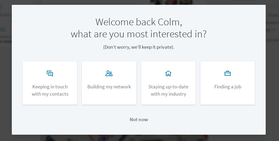 This screenshot comes from a popup-card that displays when signing in to LinkedIn.com. The text welcomes me back to the platform and then calls me by my first name. Then in rapid order, a question, “what are you most interested in?”. LinkedIn doesn't want to know what my interests are, it wants to know, right this minute, if I am present in that situation for messaging contacts, finding a job, looking for industry information or to acquire new contacts. The timing of this question is not spoken of. Why does this selection need to happen now? Why does there need to be a selection? What happens if I answer with the only exit “Not now LinkedIn, don't you know I'm busy?” As out of place, clumsy and problematic I find the mixture of informal address and impossibly timed questions, the little sentence in parenthesis “(Don't worry, we'll keep it private)” places this popup in a category of very suspicious questions. Colm, don't worry about any answer you give us on login of this site, we'll keep it private ;).
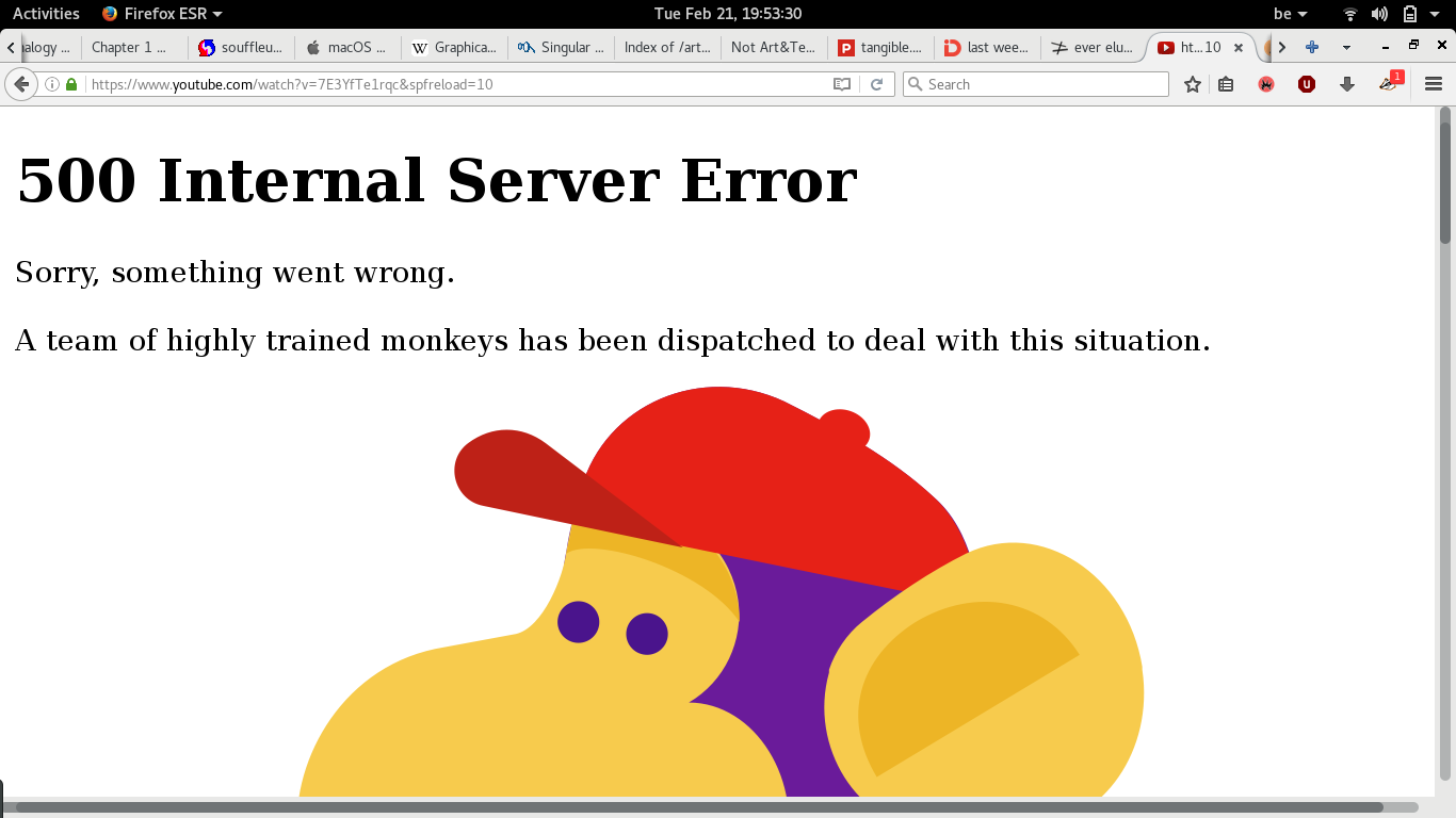 This image is an error message from a malformed URL on Youtube.com. The message prioritises the main message: “500 Internal Server Error”, followed by an apology and a resolve. Schematically, this comes off as an appropriate type of message for a situation that can understandably arise. But in the wording of the apology and resolve, visions of the actual concerns come to light. The placing of the comma in the sentence “Sorry, something went wrong” isn't saying that the service is sorry that something has gone wrong, they are responding to the request that is the URL loading by saying, sorry to that, and explaining the reason as “something went wrong”. I point out this sentence because it's object is to tell the visitor what has happened, in however little information that is. The solving of this situation comes last; “A team of highly trained monkeys has been dispatched to deal with this situation.” I don't know really where to start with this one. Forgoing the fact that youtube engineers seem to be in a highly abusive mismanaged workplace environment, has anybody really been dispatched to respond to this 500 error? Can I keep this tab open and reload it when the situation is fixed? How can I communicate with the people that are resolving my situation?
Such analysis of an error page might seem unfair. At least there is an error message page, no? My concern here is that this page exists for the purpose of telling the visitor that there is an undetermined error. But in informing the visitor of this error, there is no need to construct an image of resolve, enter into dialog if they can not respond or follow the situation. There are many more examples of these deeply confused informal addresses in this gallery. Moreover the analysis of these modes of address within interfaces leave me with a confused sense of disidentification. The more informal the tone, the more convinced I am that by engaging with this user interface, I am not in correspondence within a parametric dialog, I am simply a volunteered actor in a very set narrative. I do not know who these messages are written for, and why they are so familiar, but when I am the receiver of these messages, I do not feel any sense of connection to the corresponder, I feel suspicious. I do not identify with the person that is imagined to read the message. I feel less involved than if the site was speaking to me formally.
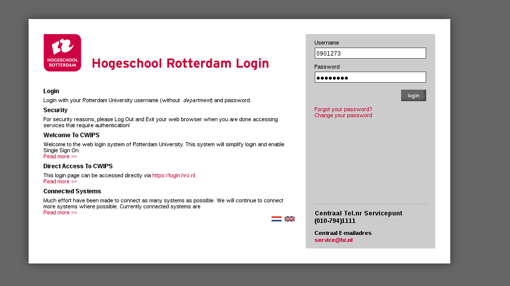
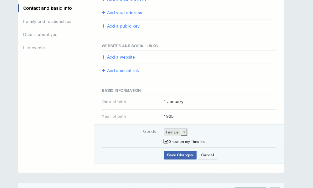
For the sake of clarity, I believe providing a counter example will help in defining informal address interfacing. Below is the login screen to the backend spaces of my current education program. Online academic spaces, as far as I can tell, serve as good counter points to informal interfacing, as in this case, I log in using my unique identifier, which is also my student number. It is an almost certainty that all online spaces that work with a login / username space identify users through unique number as shown below. It's simply that most of the time, the login interface resolves who we are using other parameters. (Sites using personal email addresses might be the middle ground.) The priorities of the academic login below are entirely different to the spaces exemplified above. The Hogeschool Rotterdam has absolutely no interest in creating a sense of conviviality here. It is up to the user/student to remember this incrementally assigned student number, and that is all. Formal as can be.
a rhetorical turn
These examples are a display of what William Davies calls “the rhetorical turn”. [ref]from “The Mismanaged Heart”(07/2016)[/ref] The rhetorical turn sees websites ask us to fill out text-boxes titled home; instead of asking us a full address. Or rather than asking for a date of birth, uses the title ‘Celebrate your birthday’ instead of asking us for a date of birth. This is a method with which surveillance is administered as a form of care. An image of community and familiarity is created by platforms, employing methods of marketing and advertising. The tone of using ‘home’ and ‘celebration’ essentially is employed as a way to confuse our defence mechanisms in order to capture more and better quality data from us. [ref]The internet privacy debate often uses the word ‘surveillance’ but in these cases, surveillance (even etymologically) is not the practice, capture is what is intended. A capture of data, to nourish powerful analytics that build a meta-identity of who we are, what our interests are, what we post and who we interact with, to sell us more targeted products. Phil E. Aigre made this distinction in 1994 → Philip E. Aigre, “Surveillance and Capture: Two Models of Privacy,” The New Media Reader (1994), pp. 737 - 760 [/ref] The reality of data capture and data analytics take many forms across user interfaces:
One final case, slightly aside from exemplary problematic modes of address, but very much in line with capture administered as a form of care: the new(ish) Facebook gender settings. Facebook making space for more ways of qualifying ones gender really seems like a very positive thing. Facebook is speaking to the queer community with this text field, as opposed to options, and saying, you tell us what you identify as. I genuinely thought this was a step in the right direction, until I went to look at the settings myself. Start typing a letter in this text field, and facebook makes suggestions based on those first letters. Suggestions not of their own, but of what other users have submitted to this form. Within this simple supposedly helpful interface action of automatic suggestion, we see that Facebook allowing for more gender options is actually a simple quest to get another way of sorting it's users into more targeted subsets.
Furthermore, interfaces that call us by first names are symptomatic of how wide spanning analytics activities can go. The function of this ultimate informality, a mostly unknown platform calling me 'Colm' as opposed to using unique identifiers, is as perverse and problematic as any of the considerations of audience show above.
“As tech companies have become fixated on constituting and exploiting social networks, cultural diversity and informal sociability are increasingly regarded as crucial sources of competitive advantage. The conviviality of smart devices and platforms is consistent with this ethos. If the function of informality is to erode the distinction between work and leisure, then informal rhetoric is a necessary feature of platforms that want to mediate and capitalise on all aspects of our lives, including work, family, and social life.” —William Davies
enforced morals
I find the informal tone used in interfaces to be at the very least, ironic. This comes from sites, services and platforms that view their potential market as the entire human race, yet, they engage in addressing us personally. The contradiction that exists between huge markets and informality highlights what the websites are after, but also shows how we users are not dealing with the people that make and manage the site, we are dealing with an embodiment of the policies of their product, translated into design, templates, interfaces and words. I feel that from this observation, we get a glimpse of how these systems see ‘us’. The view that this offers is quite different to real life conversations where sentences like the ones collected in the informal address gallery could have happened. The interest is not in establishing dialog, it is in harvesting the traces we leave as we navigate the internet. These large scale systems, these technologies, see us in very new ways. These systems are not like humans, they see with data, and think with algorithms. I believe that the view that this offers us is a very morally implicated one. It tells us that, by using these disembodied systems, we substitute our values, our motives, for theirs.
Disidentification, data centrism, enforced morals, come together to build an image of the networked space as a mono-narrative. A space in which my last choices are where I can go, not what I can do when I get there. And as user interfaces continue to succeed in their mission for seamlessness, we run the risk of letting technologies deeper and deeper into our societies, without any real resistance or questions. The interfaces and conventions that are the Internet weave themselves into all of the walks of life, becoming essential to some of them. The logics of seamlessness, integrate across not only the mechanics of systems but also of the subjects they deal with.
At this point, a quote from Eric Schmidt [ref]Google’s chairman and ex-CEO[/ref] when asked about the future of the internet: “I will answer very simply that the internet will disappear.” Of course, Schmidt is not to be taken literally here, he means that the internet will disappear into our lives through extreme integration, following the logic of The Internet of things. But as the internet disappears in Schmidt's sense, we follow a logic of Totality, the internet being one with the world and it's societies. There then being no difference between the internet and the world. [ref]This point of thought is developed in a few instances of Zach Blas's work, my favourite being the recent SON[I]A podcast from Radio web MACBA[/ref]
resistance
I believe that in the observation of the rhetorics of online software interfaces, a lot can be understood about the agendas of the organisations on the other side of the interfaces. So here is the task I present; to critically analyse the rhetoric portrayals that interfaces give way to. By this analysis, to practically and discursively review our understandings of computer and network infrastructures by using critical methods to counter act seamless integration of our networked spaces and to counter act any methodology that might result in the internet being understood as a totalised space.
To achieve this task, I present this very platform, titled adversarial interfaces. A space for resisting seamlessness by gathering various intellectual and practical objects with which we can respond to the moralities that internet platforms and their interfaces force onto us.
Adversarial design is a notion developed by Carl DiSalvo in a book of the same title in which adversarialism is pointed out as a way of acknowledging the political aspects of the technologies that surround us. Adversarialism qualifying types of designed objects is defined as projects doing the work of Agonism. Agonism itself is a political theory that emphasises the potentially positive aspects of certain forms of political conflict.
I chose to follow along the path set out by DiSalvo because in acknowledging the political dimensions of designed objects there is space for political and moral pluralism. Being critical about the landscape of media spaces discussed above must include ways of seeing all sides of the debate. By being pluralistic, I can stand by my own personal morals, but not use the same methods of enforcement of these onto the readers of this space, being smart about criticism starts with looking at all the possibilities and all the possible standpoints within this debate.
In order to critically analyse the rhetoric portrayals that interfaces give way to, I have layed out a few methods. The first of these are multiple specific case studies. Studies similar to the comments made on the three - four example of informal interfaces in this page. These cases single out specific problematic doings and give perspectives on specific situations. These aim to take out elements from their broader constructs, in ways such as looking only at the language of the addresses used in user interfaces.
Another method is to engage in the use and making of critical making projects. In this section, I bring together existing projects and develop new objects that, to my mind, in this discourse, help the question of adversarial interfaces along.
Lastly, (as of now) making a space also for the theoretical frames and writings that have picked apart some dimensions of this debate. The interactions between case studies and conclusive writings such as the ones gathered in the theoretical scaffolding appended to this site are ones I hope to stimulate more as this question develops.
All together, a key standpoint is to say that these questions still in development, are still active, as the spaces they speak of are in constant movement. This is not finished research, because it's areas are vast and plentiful. I'm glad to begin with adversarial interfaces, there is a lot to do.